Development
In this category you'll mostly find content related to Software Development in the Microsoft space. Azure development, SharePoint development, .NET, and more.
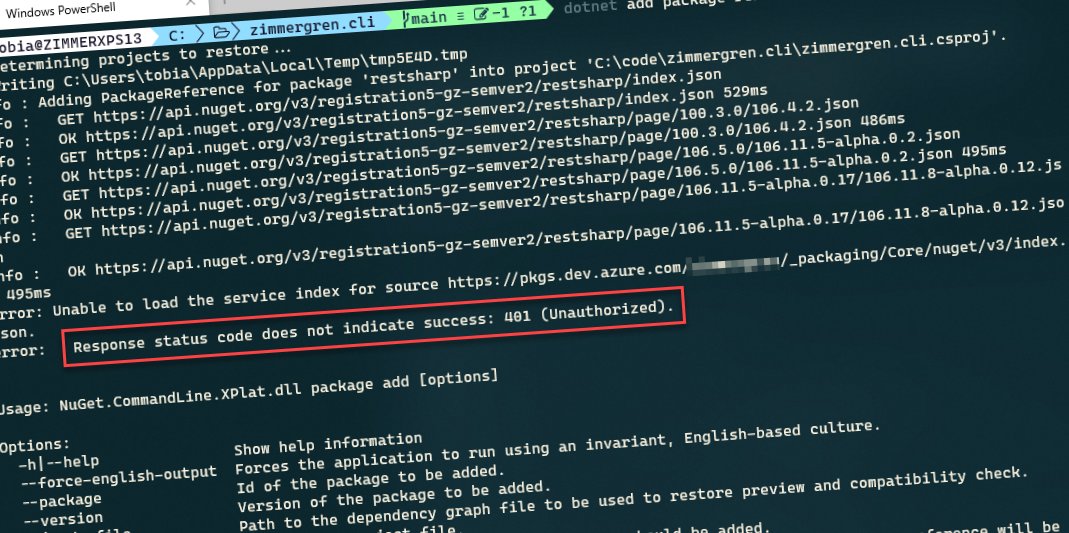
Fixing NuGet error: Unable to load the service index for source - 401 Unauthorized Paid Members Public
Setting up an entirely new project and getting things off the ground is usually the quickest part of our development process for a project. However, not its not uncommon to stumble into various issues with NuGet, if you're a dotnet dev. Something I've ran into several
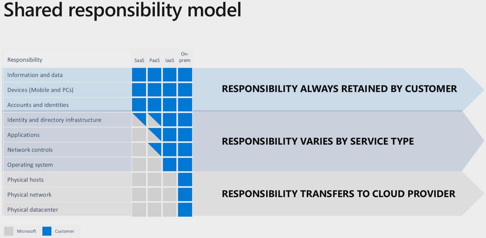
Embrace a Secure Software Development Lifecycle (SDLC) for Azure Paid Members Public
While threats are ever-increasing, so are the capabilities, methodologies, and technologies we have at our disposal to mitigate risks at a higher cadence than ever before. In this article, I'll talk about the responsibility we have as developers, solution architects, DevOps engineers, and anyone else involved in your

Fixing: Unable to locate the .NET Core SDK. Check that it is installed and that the version specified in global.json (if any) matches the installed version. Paid Members Public
When working with Azure DevOps, or locally sometimes with Visual Studio, you may get the following error if there's a mismatch. It can depend on what versions of the SDK you've got on your machines, either local or build agent. Unable to locate the .NET Core

Building a MEAN (MongoDB, ExpressJs, Angular and Node.js) api app using TypeScript and host it with Heroku Paid Members Public
This post will be an introduction to how you get up and running quickly with building a node.js API which runs through Express on node.js and communicates with a deployed MongoDB database, using TypeScript. Simply put: a MEAN stack application with typings. Oh, except Angular. Since I'
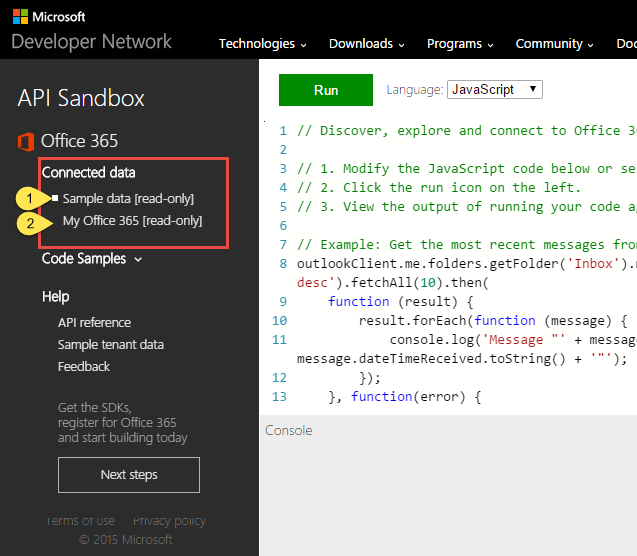
Office 365 API Sandbox - Learn how to use the API's with your own tenant data! Paid Members Public
> Post updated 2015-02-25 to include support for C# Up until recently I’ve been using a lot of browser extensions and client-side tools for running test-queries and sample-code toward real data or developer-data in our tenants using the REST API in Office 365 [https://msdn.microsoft.com/en-us/office/
Getting started with Office 365 development - Part 1 - Setting up your environment Paid Members Public
> This article is part of a series about “Getting started with Office 365 development”. * Part 1 – Setting up your environment [https://zimmergren.net/technical/getting-started-with-office-365-development-part-1-setting-up-your-environment] * Part 2 – Communicate with the Exchange REST API [https://zimmergren.net/technical/getting-started-with-office-365-development-part-2-communicate-with-the-exchange-rest-api] * Part 3 – Building a sample Web Forms application that integrated with
Fixing: The HTTP header ACCEPT is missing or its value is invalid - SharePoint 2013 Paid Members Public
So just a simple tip in case anyone bumps into the same issue as I had a while back. Going from Beta to RTM, some things changed in the way you retrieve values using REST in the SharePoint 2013 client object model. In the older versions of the object model,
Conditionally Enable or Disable a Button/Command in your SharePoint 2010 custom Ribbon group Paid Members Public
In most of my recent projects I’ve been required to hook up some custom functionality and add custom forms, pages and Web Parts. Some of the forms and pages I designed needed to be launched from the Ribbon menu, which of course is contextual. This basically means that when


Recent comments