I previously wrote an Introduction to SharePoint Online which was highly appreciated, so now I’m doing a quick follow-up on how you can easily customize the appearance of your SharePoint Online site.
Since we today can’t really do any customizations using .wsp packages or deploying custom code on the standard services, we’ll have to use the SharePoint Designer to do our customizations.
I will show you a quick-intro on how you can get started with customization of your sites in SharePoint Online.
Pre-requisites
If you want to be able to follow along with this article yourself, please make sure that you’ve fulfilled the requirements below:
- SharePoint Online Site Collection - This will work with any OOB installation you’ve got as well though
- Microsoft Office SharePoint Designer
- You’ve got some custom Master Page lying around - If not, grab the WSS 3.0 Example Master Pages from Microsoft here
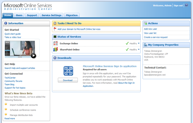
- Single Sign-in application installed - You can download the Single Sign-in application from your Microsoft Online Services Admin portal
Preparing for customization with SharePoint Designer
You should install the Single Sign-in application, and log in to your account, before proceeding past this point. The application looks like this, and you should see something like the following once logged in:
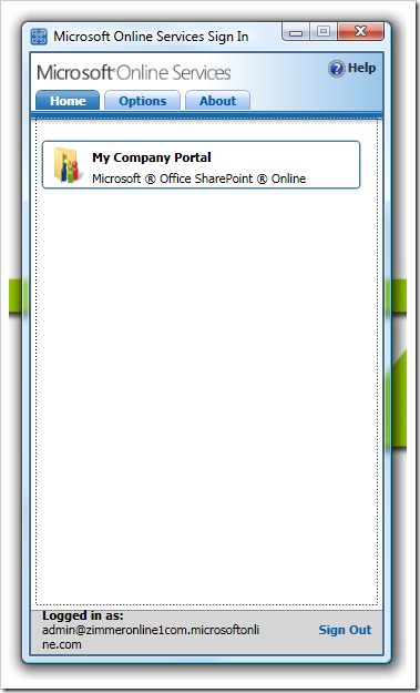
Once logged in, you should have the icon down in your system tray, and don’t need to worry about it anymore – you’re always logged in (the blue square-ish icon, compare to the image’s titlebar-icon above):

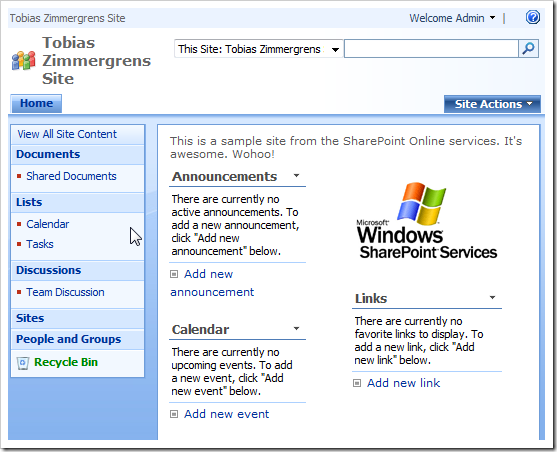
This is what your site basically looks like from scratch
Out of the box, our default.master looks like this (I’ve made it squeeze into the frame here):
SharePoint Designer – here we come
Now that we’re always logged in, and don’t need to worry about providing credentials all the time, let’s proceed with SharePoint Designer.
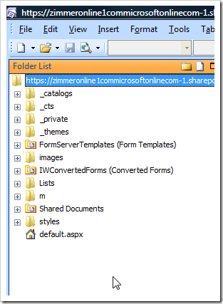
Open SharePoint Designer, open your Site to edit, get a move on
- In an ordinary fashion, open SharePoint Designer and open your site: - File – Open Site
- URL of the Site Collection
- Let’s roll!
Customize the Site Collection
There’s a few options you’ve got when you want to customize the Site Collection from here.
One option is of course to create new and/or modify existing Master Pages in the Site Collection – which is our task for the day. We are going to modify the default.master so it will match our corporate branding, and in order to do that you can follow along with the following steps.
Note: I’m not digging down into the css/master pages right now, if you want more information on how that works – I urge you to check out www.heathersolomon.com/blog for great resources on branding.
Note 2: I’m using the WSS 3.0 Example Master pages for this.
Step 1 – Import all the required resources
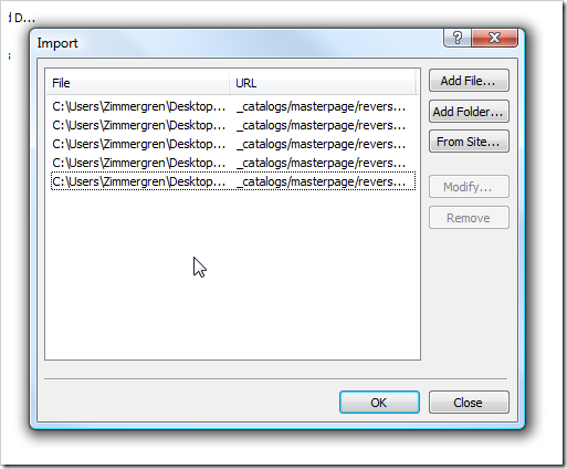
- File – Import
- Choose the “File” option
- Click “Add Folder” - Select the folder where your _catalogs files reside
- Repeat this for all resources you need (styles, images, what-not)
- Repeat the aforementioned step for every new set of resources you want to import.
As a result, you may now have a bunch of .master files, a bunch of new images and a set of styles hooked up with your Site Collection. No beef there:
Step 2 – Validate the resources
Make sure the new files are in the right place in your Site Collection structure
- **_catalogs**- masterpage - awesome1.master
- awesome2.master
- awesome3.master
- …
- images- CompanyNamedFolder - zimmergrenHeader.png
- zimmergrenLikesSharePointOnline.png
- …
- imageFile1.gif
- imageFile2.png
- …
- styles- CorporateNamedFolder - zimmerCustomCSS.css
- tozitAwesomeCSS.css
- …
- styleFile1.css
- styleFile2.css
- …
Step 3 – Modify the default.master and apply our corporate branding
To make this quick’n’easy, we’re going to use the completely ready master pages from the example package I mentioned earlier.
- Open any of the new .master pages - Copy the entire content
- Open the default.master page - Replace the entire content with the one in your clipboard
- Save
- Smile and cross your fingers (not really needed, but it’s more fun this way..)
The default.master has now been customized, and the all-too-familiar information icon appears right next to the file, telling us that it’s customized from the definition. From there, we can of course always right click and choose “Reset to Site Definition” in order to revert any and all changes we’ve done.

Step 3 – Alternative approach (Recommended if you don’t want to mess with the original)
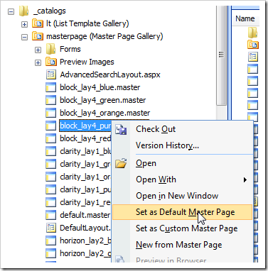
If you don’t want to replace the contents of the default.master, you can of course simply cut to the chase by clicking one of your other .master pages and choose “Set as Default Master Page” in order for it to be set as the default master without replacing the actual default.master:
Final results
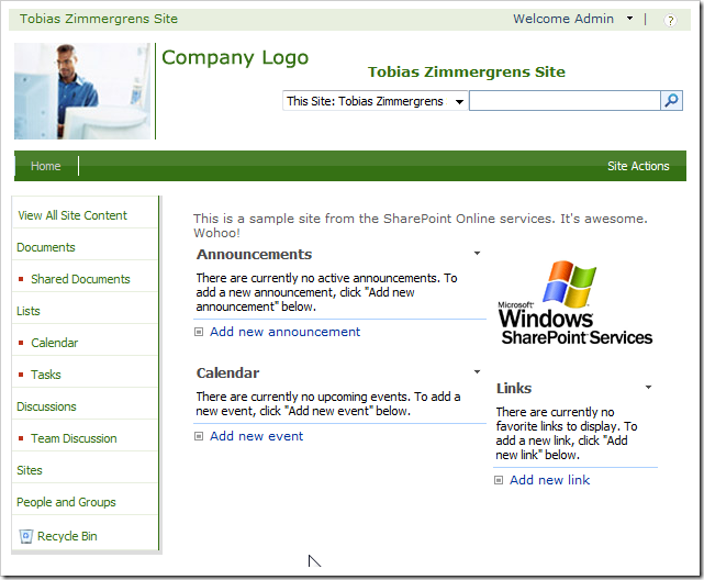
If all goes well, we should now see our “branded” master page with some new images, some custom css and a bit of a new look to it, like this:

Summary
So, in this article I showed you how you easily can alter the look and feel of your SharePoint Online site by using the Example master Pages provided from Microsoft.
I’ve been getting a lot of questions regarding weather or not it is possible to actually DO ANYTHING with your SharePoint Online installation.
The answer is: Yes. But it’s quite limited. We will discuss the limitations and more fine-grained possibilities with the Standard vs. Dedicated options another time.
Comments are closed
Archived comments
Hi there, your article is really informative. I have a question - you did mention in this article "Since we today can’t really do any customizations using .wsp packages or deploying custom code on the standard services, we’ll have to use the SharePoint Designer to do our customizations.". Then this link http://msdn.microsoft.com/e... is explaining something else?
Do you mean that we can not deploy sandbox solution in SharePoint Online?
I am confused. could you please clarify my doubt?
Thanks,
Khushi
Hi Khushi,
If you take a look when this post was posted (Way back in 2009) you'll understand that his post refers to BPOS (Business Productivity Online Suite) which in turn means that this article is focusing on SharePoint Online for SharePoint 2007, not 2010.
With that said, Sandboxed Solutions works perfectly fine in SharePoint Online with Office 365.
To Summarize: This article was written for SharePoint Online based on 2007.
Cheers,
Tobias.
Thank you so much Tobias. Now I understand. Actually, I just started to peak into Sharepoint Online with Office 365, could you please suggest me any good resource where I can learn more about it?
Regards,
Khushi
Hi,
Take a look here: http://sharepoint.microsoft...
You'll find both technical and other documentation.
Regards,
Tobias.
Thank you so much Tobias. The link that you recommended has really lots of information.
Regards,
Khushi
You are most welcome, Khushi.