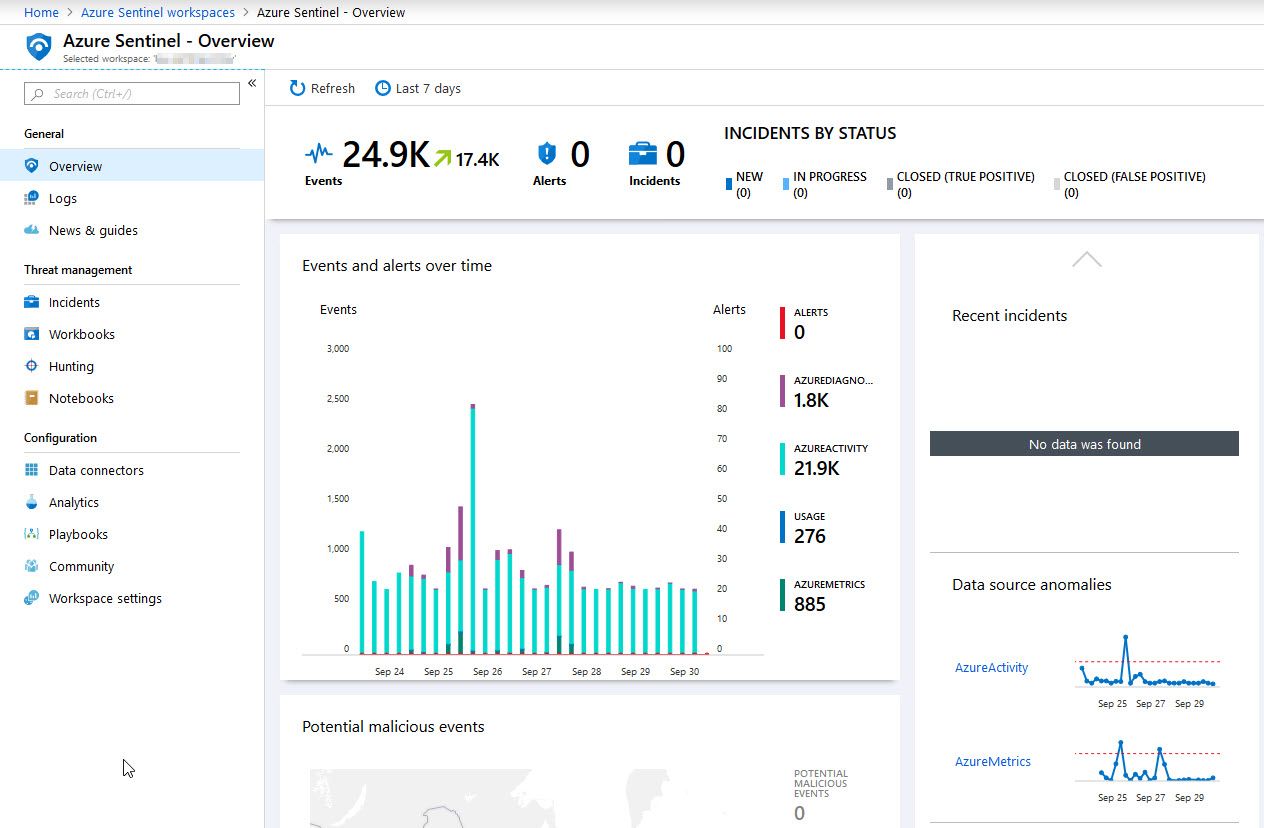
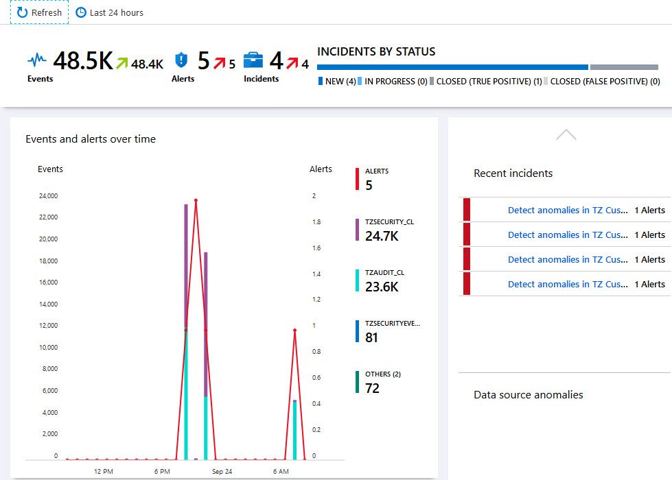
I like when I can paint a picture of how Azure Log Analytics workspaces are ingesting data, what cost, and how the telemetry around the data looks.
With Microsoft’s built-in workbook template in Microsoft Sentinel, named “Data collection health monitoring”, we can visualize the data ingestion and quickly understand our workspaces and the data we have.
Use case: Understand the cost of data ingestion
When operating distributed cloud solutions across regions and continents, it gets tricky to track everything for multiple reasons.
Depending on regulatory requirements, we might be obliged to separate workspaces depending on where the data resides and what other data might be ingested into the same workspace.
In reality, we have many Azure Log Analytics workspaces spread across the globe, and that’s okay. However, it does present additional challenges for cost analytics and understanding the impact of the data ingestion at scale.
With the “Data collection health monitoring” workbook by Microsoft, understanding this data becomes much more manageable.
When it comes to cost: The more data you have, the more expensive it gets as we pay per GB in the data ingestion.
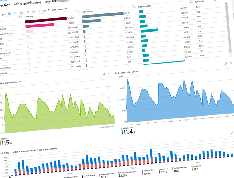
Use case: Understand the amount and weight of the data ingested
Working with Azure Log Analytics, I realized that I need to optimize costs a lot and limit the amount of data I ingest. However, it’s not always easy to decide what information to cut down on or exclude.
I believe this decision becomes more manageable when we can understand the amount of data in different tables and the weight of that data. Weight, in this case, could mean the number of items or size per entry; But, usually, it’s a combination of both - in the end, it’s the ingested GB for which you pay.
Azure Log Analytics data ingestion visualization in Microsoft Sentinel.
When reviewing the data here, I can see that I have two main points of data ingestion where I have a lot of ingested GB’s.
- App Traces.
- App Dependencies.
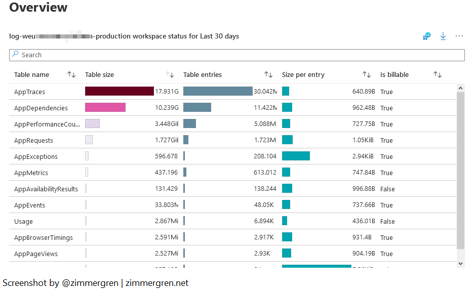
Now, talking about App Dependencies, there are crucial considerations we need to make in our custom applications for whether to log failing dependencies or not.
I wrote a post about Exclusing failing dependencies from Application Insights logging. This blog post talks about how and why you might want to filter out specific dependencies that are outside of your control - because you will pay for them.
We’ve taken a look at the data here, and every situation is, of course, different. You might have another scenario that dictates another decision to include or exclude in your custom logs. Now we at least know where to start looking.
Here’s another view to help us understand how the data is spread across the different entities and tables.
Microsoft Sentinel workbook for data collection health monitoring for Azure Log Analytics.
Use case: Discover anomalies in data ingestion
It’s not always easy to discover patterns and service behavior. With the anomaly analysis, we see a hint at where we might need to spend some time looking.
During the investigation of anomalies in data ingestion, I can hopefully try to understand when and why they happen and correlate with something else that’s happening.
It’s not uncommon that there are delays in data ingestion, and we get a service notification about it. With the anomaly analysis, we can discover more things about how data is being ingested.
For example, we can determine if ingestion anomalies happen during heavy load, on specific dates, or immediately after a new release.
The queries for these anomalies are based on the KQL (Kusto Query Language) syntax with series_decompose_anomalies.
- Read more about series_decompose_anomalies.
Here’s the anomaly overview.
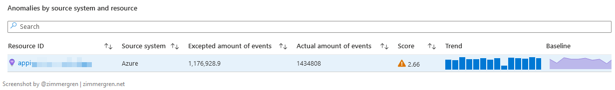
Anomalies in Application Insights.
There’s the anomaly graph that displays how the baseline and trend both correlate. The baseline is what we expect - and the anomalies are visualized contra the baseline so we can understand how much we deviate from the expected “normal operations”.
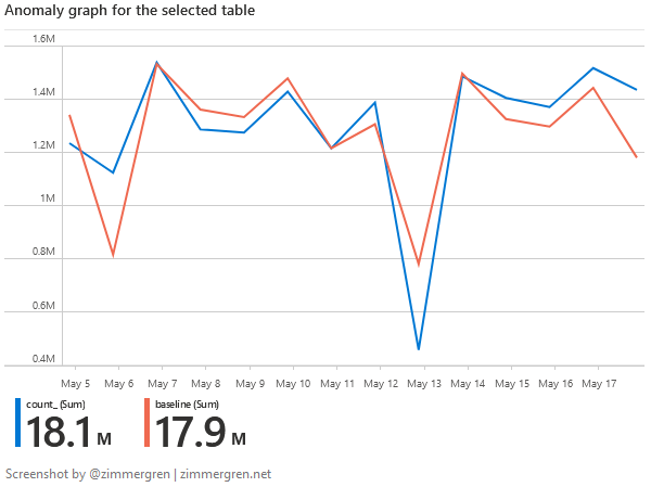
Anomalies versus Baseline in Azure Application Insight anomaly analysis.
When changing the queries to visualize this over a more extended period, I can more easily understand if the patterns happen regularly, intermittently, or very seldom. It also helps me determine whether they occur in correlation to other events in our releases and infrastructure upgrades or entirely standalone and triggered by outside factors.
General insights
I shared a few use cases previously. Here are other general insights we can get from the built-in workbook to better understand our data ingestion and the health of our Azure Log Analytics workspaces.
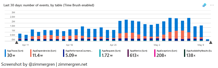
Number of events and table volume over time
Most of my data entities are sized similarly, and often the size of the tables correlates with the number of events ingested. That is to say; I don’t usually have one type of event that weighs exponentially more than others during spikes.
For one of my Log Analytics workspaces, in the last 30 days, I’ve ingested 49 300 000 events, with a total table volume of 37 billion.
When I review the visuals here, I can again compare this with expectations based on releases, new deployments, scaling out, and more.
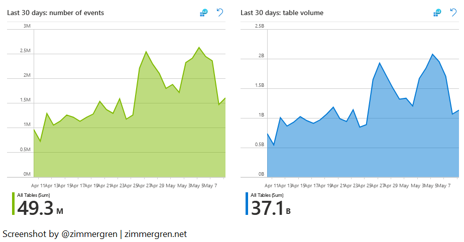
Visualize the data ingestion volumes and number of events in Log Analytics using Microsoft Sentinel.
Events per second
I find the data around EPS, or Events Per Second, interesting. I can see how many events we ship per second, on average.
In the example I’m showing here, I’m ingesting below 25 events per second on average. As I can see to the right, under “Highest EPS” during peak hours, I have consumed more than 700 events per second.
Knowing my applications, this looks good. At one point in time, we were at 11,000 events per second due to dependency failures. I, fortunately, found a solution to those, which helps reduce the cost and the noise.
- Read more about excluding failing dependencies here.
Keeping tabs on these numbers helps me understand the health of my distributed applications, and even though there have been spikes in workload and, therefore, data ingestion recently, the average will still tell me a balanced story. When the average moves up quickly, I know I need to take another look.
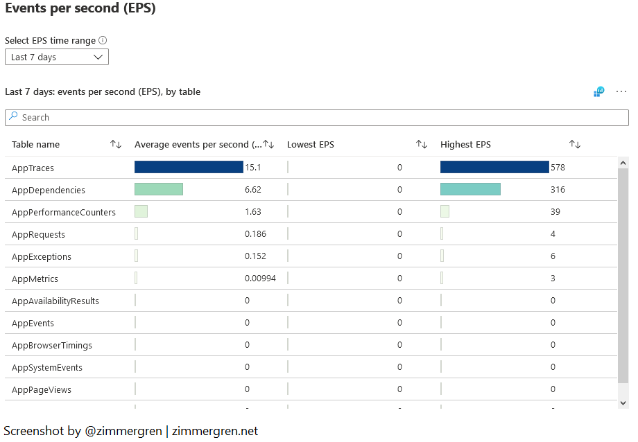
Log Analytics Events per Second (EPS) visualized in Microsoft Sentinel.
Last event received
The “Last event received” view might not be one I use extensively, but that helps me see how up-to-date the information is.
I see this as a health probe or ping. I don’t use it for anything other than verifying that all my data is regularly streaming in.
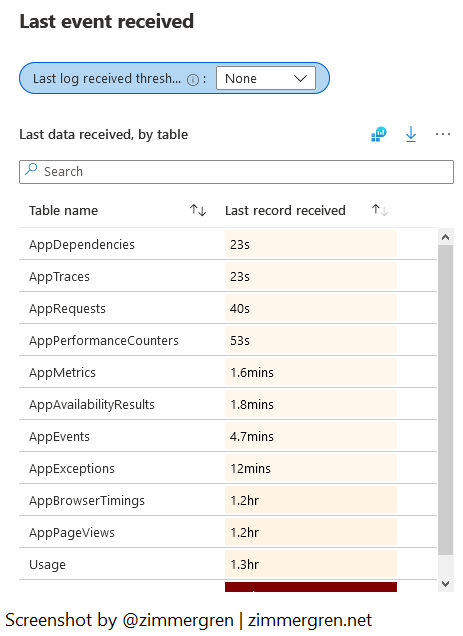
See recently ingested events in Log Analytics using Microsoft Sentinel.
Summary
That’s all the tips this time. Microsoft Sentinel is turning into a central point of entry for many of my investigations and operational troubleshooting activities. Quickly seeing the data visualized and up to date is a beneficial way to make informed and data-driven decisions.
Relevant reading:
- Excluding failing dependencies from Application Insights logging (Zimmergren)
- Azure Monitor Service Limitations (Microsoft Docs)
- KQL: series_decompose_anomalies() (Microsoft Docs)
Comments are closed