
SP 2010: Developing for performance Part 6 - CSS Sprites
SharePoint 2010 developing for performance article series:
In this series of articles I will briefly introduce you to some key concepts related to developing for performance in our SharePoint 2010 applications.
Related articles in series
- SP 2010: Developing for performance Part 1 - Developer Dashboard
- SP 2010: Developing for performance Part 2 - SPMonitoredScope
- SP 2010: Developing for performance Part 3 - Caching in SharePoint 2010
- SP 2010: Developing for performance Part 4 - Logging
- SP 2010: Developing for performance Part 5 - Disposal patterns and tools
- SP 2010: Developing for performance Part 6 - CSS Sprites
- SP 2010: Developing for performance part 7 - Crunching those scripts
- SP 2010: Developing for performance Part 8 - Control that ViewState
This is part 6.
In web development today its very important to keep performance in mind – this is especially important in any site that is published externally or for whatever reason will have heavy traffic. In this article I will briefly cover the area of CSS Sprites, how they are implemented in SharePoint 2010 and of course how you can create them yourself.
Introduction to CSS Sprites
CSS sprites is a technique used to reduce the number of requests for images on a site when visiting it. Normally when you see a web site today there’s plenty of files being requested and loaded upon the request made. With the use of CSS sprites we can reduce the amount of files that we need to request from the server by consolidating many image files into one file and use CSS to display the correct part of that consolidated image when it needs to depict your specific image.
Short in short: Take a bunch of separate images and smack them together to one single file. Voila, you’ll only need to request one file from the server.
SharePoint 2010 and CSS Sprites
So why are we talking about CSS sprites here anyway, isn’t this supposed to be all about SharePoint and awesomeness? But of course, and that’s exactly why we’re talking about it – CSS sprites are a natural part of a normal SharePoint 2010 installation. By default, there’s CSS sprite techniques used to render and display images in (for example) the Ribbon menu.
These are some samples of images used with CSS sprites in SharePoint 2010:


As you can see in any of the two images above the many small images/icons have been smashed together into one single image file and then there’s some CSS magic to position it. This is basically what it’s all about.
Why should I bother learning to use CSS sprites?
This would be like asking yourself the question "Why would I develop something that is of great performance" or "Why would I do something awesome". No more rhetorical questions please ;-)
Of course the reasoning behind creating CSS sprites are that you can develop web applications that can reduce the page load and enhance the performance of your sites and make them load quicker and be more responsive.
Creating CSS sprites for my applications? How?
There’s a few ways to create CSS sprites for you own applications.
- Do it manually. - This approach requires a lot from you (the designer) in order to hack it up properly and make sure it’s pixel-correct.
- Do it using a tool - This approach is what I normally use.
- With any of the tools on the market to create CSS sprites you’re better off than doing it manually – all you have to do is dump you images into an application and it’ll output one single image along with the CSS markup for that. Awesome.
For obvious reasons mentioned above I will not be demonstrating how to do this manually but will rather be using any of the hundreds of tools out there to create the sprites.
In this example I’m going to use my friend Waldek’s tool called SpriteGenerator.
There’s a bunch of other tools available to create and generate these sprites as well of course, bing.com is thy friend.
How to: Generate CSS sprites using a tool
In this section I’ll talk you through our current application and what it looks like, what we want to achieve and finally how to achieve it.
Our current application, a visual sample
This is my current sample application before we start using sprites.
- Control Panel Web Part:

- Visual Studio project containing all the images and resources:
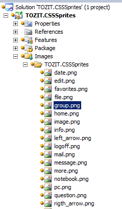
As you can see there’s quite some images being loaded. The images used in the application (my Web Part) will be fetched using a normal HTTP-request and that’s when one could realize how quickly those small requests can add up to impact performance.
Now, in order for us to utilize the CSS sprites instead of making a request for each image separately, we’ll use the SpriteGenerator and create us some nice CSS sprite magic.
Using the Sprite Generator
Like I said before, we’ll be using Waldek’s SpriteGenerator for this sample.
Just open it, put in the images you’d like for it to make some magic with and then simply hit the magic button.

This is one consolidated image containing all the graphic from my application. But instead of having about 30 different icons in my project, I now have only one.
The generated CSS can look something like this:
.sprite { background: url(‘/\_layouts/images/TOZIT.CSSSprites/TOZIT\_Sprite.png’) no-repeat top left; }
.pc { background-position: -0px 0; width: 47px; height: 64px; }
.question { background-position: -47px 0; width: 53px; height: 64px; }
.info { background-position: -100px 0; width: 54px; height: 64px; }
.mail { background-position: -154px 0; width: 54px; height: 64px; }
.more { background-position: -208px 0; width: 54px; height: 64px; }
.user { background-position: -262px 0; width: 55px; height: 64px; }
.world { background-position: -317px 0; width: 55px; height: 64px;  }
.video { background-position: -372px 0; width: 56px; height: 64px; }
.favorites { background-position: -428px 0; width: 57px; height: 64px; }
.edit { background-position: -485px 0; width: 60px; height: 64px; }
.date { background-position: -545px 0; width: 64px; height: 57px; }
.file { background-position: -609px 0; width: 64px; height: 64px; }
.group { background-position: -673px 0; width: 64px; height: 58px; }
.home { background-position: -737px 0; width: 64px; height: 62px; }
.left\_arrow { background-position: -801px 0; width: 64px; height: 59px; }
.logoff { background-position: -865px 0; width: 64px; height: 78px; }
.notebook { background-position: -929px 0; width: 64px; height: 51px; }
.rigth\_arrow { background-position: -993px 0; width: 64px; height: 57px; }
.search { background-position: -1057px 0; width: 64px; height: 61px; }
.sound { background-position: -1121px 0; width: 64px; height: 58px; }
.stop { background-position: -1185px 0; width: 64px; height: 59px; }
.vault { background-position: -1249px 0; width: 64px; height: 53px; }
.message { background-position: -1313px 0; width: 66px; height: 64px; }
.image { background-position: -1379px 0; width: 84px; height: 84px; }
.tozitlogo { background-position: -1463px 0; width: 250px; height: 101px; }
This means is that you now have the ability to actually use only one single image to portray several.
With an updated Visual Studio Project, it might look like this:
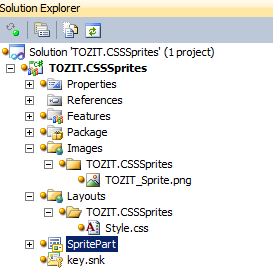
Some of the HTML can now pull the images in easily like this:
<span class="height70p sprite more"></span>
Does using CSS Sprites affect requests and performance?
Dealing with sprites isn’t very hard to get started with as you saw in the previous short samples. But what’s more interesting from a performance perspective is of course how it can affect the performance of the requests being made towards the server.
Let’s do some generic Fiddler-magic to see what the requests look like without using sprites and then what the requests look like with the use of sprites.
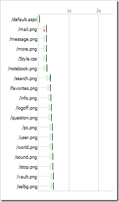
Fiddler test 1: NOT using CSS sprites
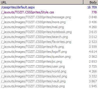
- Request Count: 17 total requests to the server.
- Bytes Sent: 1,137 bytes
- Bytes Received: 76,164 bytes
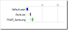
Fiddler test 2: Using CSS sprites

- Request Count: 3 total requests to the server.
- Bytes Sent: 1,722 bytes
- Bytes Received: 139,369 bytes
What you can easily conclude from the initial tests is that there’s more requests without the CSS sprites, while the size can be slightly larger for a consolidated image when using the sprites.
It’ll load and render quicker by downloading only the 3 files instead of the 17 files due to the aggregation time it takes to render the content.
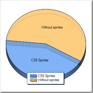
I did some tests with two machines, two different projects and a couple of clients to request the pages and the results (on average) was something like this in rendering time. The chart below is a relative visualization of the results per average.
Summary
The impact of a system with a lot more requests for data than these samples, more users and in generally more traffic would differ a bit more than the charts here. Using sprites in combination with caching the data is a good practice to keep the amount of requests to the server to a minimum.
Even if this minor change don’t have any critical impact on improving the performance it’s important to consider. "All improvements are good improvements".






Recent comments